Oregon State’s typography is flexible in a wide range of situations. When used thoughtfully, typography becomes an effective brand tool that can add visual meaning to what is communicated.
Flexibility comes from using a variety of type families that bring different strengths and personalities, depending on how they are used in relation to each other.
Our university fonts — Stratum 2, Georgia and Kievit — have been selected because of their beauty and utility, their relationships to one another and their legibility at a variety of sizes.

Stratum 2 is our display font. It works best for headlines at 18 points or larger. All weights of the font are appropriate for use in headlines. Due to the geometric nature of the characters, the lighter weights of the font are recommended for uses smaller than 18 points, such as in subheads or pull quotes. Never use Stratum 2 for body copy.
Georgia is our serif font. It is best suited for headlines and subheads, and should not be used for body copy.

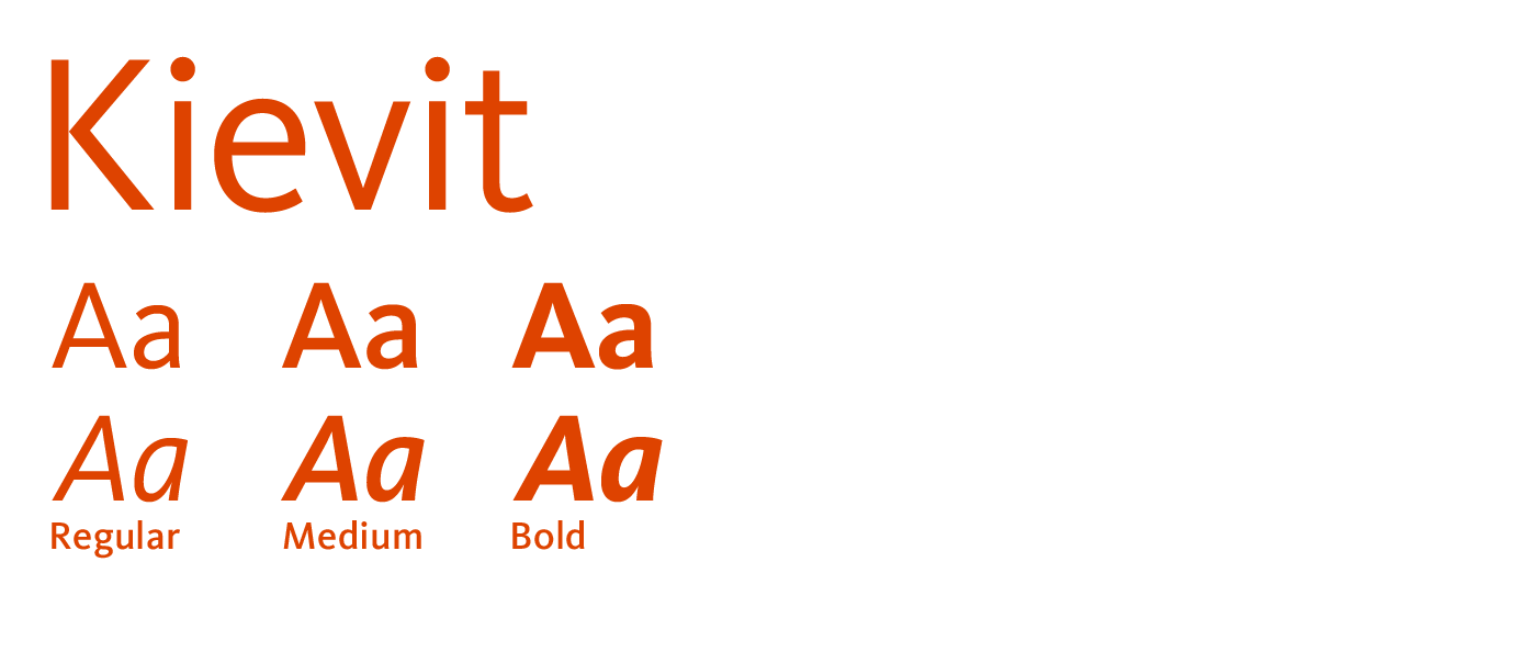
Kievit is our workhorse font. We can use it for smaller headlines, body copy and captions. It is a highly legible, cleanly constructed face that is suitable at sizes from 5 to 19 points.
Note: Because of licensing restrictions when working on the web we use Open Sans as a free alternative.
Windows:
Download the font .zip file where it's easy to find on your hard drive and unzip the file. Go to Start > Control Panel > Appearance and Personalization > Fonts. Click and drag the unzipped font files into Fonts. The fonts should copy and install automatically.
Note: If you receive an error message "the requested operation requires elevation," it means you are not logged in as an administrator. Contact Community Network for more information to bypass this message.
Mac:
Download the font .zip file where it's easy to find on your hard drive and unzip the file. Double-click on the font file to open it, then click Install.
In marketing and communication materials, our brand fonts should be used. There are circumstances (e.g., Microsoft Word or PowerPoint), however, when the brand fonts will be unavailable. In those circumstances, these alternative system fonts should be used in lieu of the brand fonts. This page offers appropriate substitutes that are freely available on all computers.
The recommended fonts for business correspondence are:
Try to avoid using text as graphics; all text on Oregon State webpages must use machine-readable system text. Graphic text should never be used as major navigation. Occasionally you may want to use graphic text for highlights or internal ads. Don't use more than a few highlights per page and always use "alt" text in the image that fully describes all text appearing on the image.