
Inspired by the state flag, Oregon State University’s institutional logo pays homage to the university’s 150 years of service as the state’s land grant institution.
The logo, which appears on all OSU marketing and communications materials, is designed to clearly identify Oregon State in all media platforms, including digital and mobile applications.
As the primary identifier for Oregon State University, the logo must be used on all forms of communication and whenever the university is being represented.
Consistent use of the logo strengthens recognition for Oregon State and helps build a unified brand. Unique logos for academic, administrative or research units undermine this effort and are not permitted, without exception. A logo is defined as an image that uses the same shapes colors, font arrangement and visual lock-up of elements, in repeated use.
Anatomy of the Logo
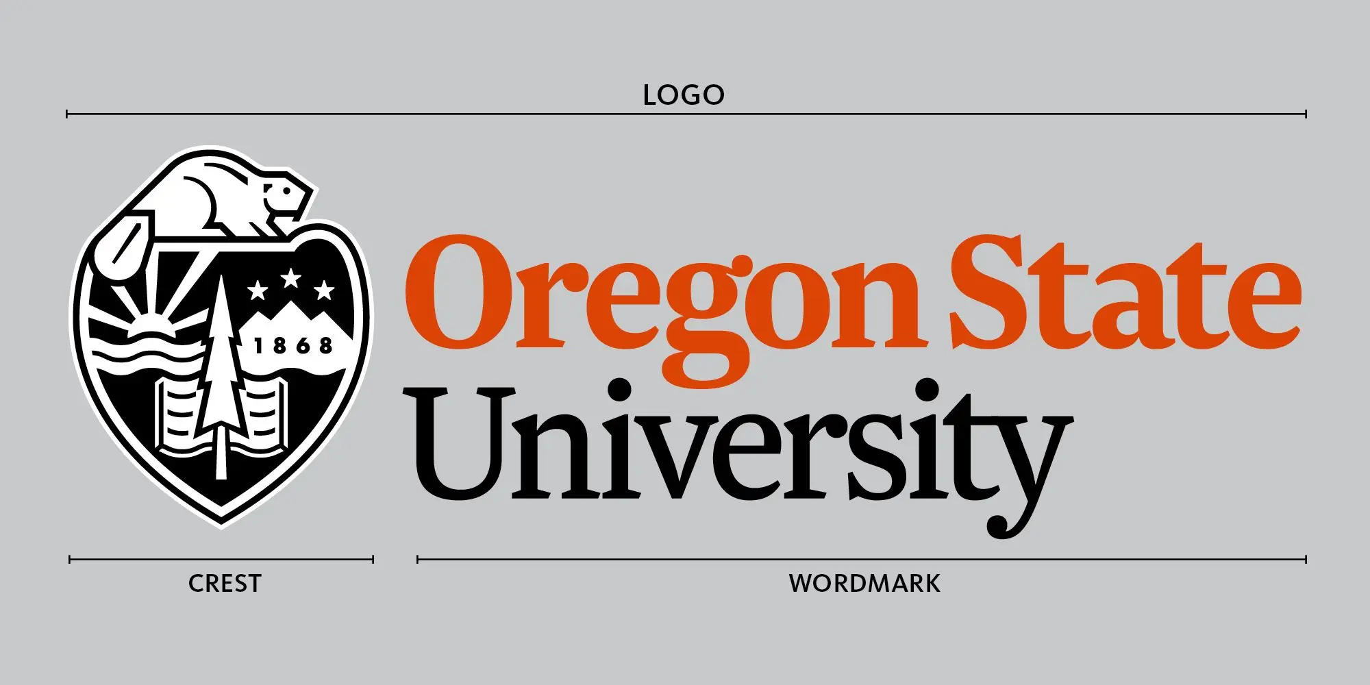
The Crest
The crest should be black and placed on a field of white, which allows for consistent use across different color backgrounds and photos.
The Wordmark
The wordmark is a custom letterform and cannot be replicated by typing the letters. When possible, the wordmark should be two-color, using combinations of Beaver Orange, Paddletail Black and Bucktooth White. Colors should be chosen that provide enough contrast with the background color or image.
The Logo
The crest and wordmark are collectively known as the logo.
Configurations
There are two configurations of the logo, including a horizontal and vertical option. The crest and wordmark may be separated for select applications, like on banners or promotional products, however, both elements must always be seen in the same field of vision. The crest must used in it's entirety and individual elements cannot be used separately.
Correct Logo Use
Multiple versions of the logo have been created for different color backgrounds.
INCORRECT REVERSED LOGO
A common mistake is reversing the crest. The beaver should always be the lighter color compared to the other colors in the crest or background. Please refer to the art sheet for the correct version of the logo.
Placement
For most printed materials like posters, brochures and fliers, the logo must be placed at the bottom of the piece. Use the grid system below to determine the space for where the logo can be placed. It can be positioned anywhere within that bar to best meet design needs. In some instances, like on pull-up banners, the logo can be placed at the top of the piece in order to be seen.
![]()
![]()
Minimum Size
In order to ensure legibility, the horizontal logo should not appear smaller than 1.375 inches wide in printed materials. The vertical logo should not appear smaller than 1 inch wide in printed materials.
Clear Space
Clear space must surround the logo to ensure legibility and provide the greatest impact.

The amount of clear space for the horizontal logo must be no smaller than the width of the “O” in the Oregon State.

The amount of clear space for the vertical logo must be no smaller than the width of the “Or” in the Oregon State.
Incorrect Uses
The logo is a registered trademark and cannot be altered in any way. The following examples are not permitted under any circumstances.

Beaver Logo
The beaver logo is the primary mark for the Department of Intercollegiate Athletics and its entities. Academic, administrative and research units, in addition to sponsored student organizations are permitted to use the beaver logo in their materials and promotional items. The beaver logo should never replace the Oregon State University logo. For a full list of design guidelines and correct uses, please visit Trademark Licensing.

Additionally, in order to build brand awareness and maintain consistency, stylized, hand-drawn or cartoon images of beavers are not permitted.
Presidential Seal
The Presidential seal is reserved for use by the Office of the President, the Office of the Provost, Commencement programs and university diplomas.
